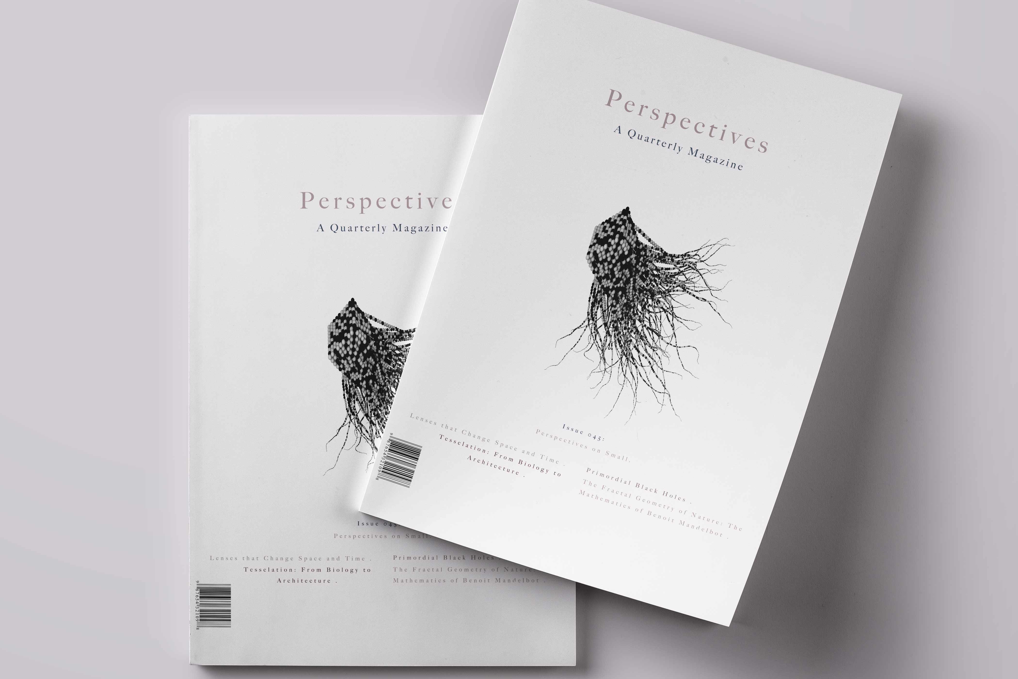
Perspectives
Perspectives
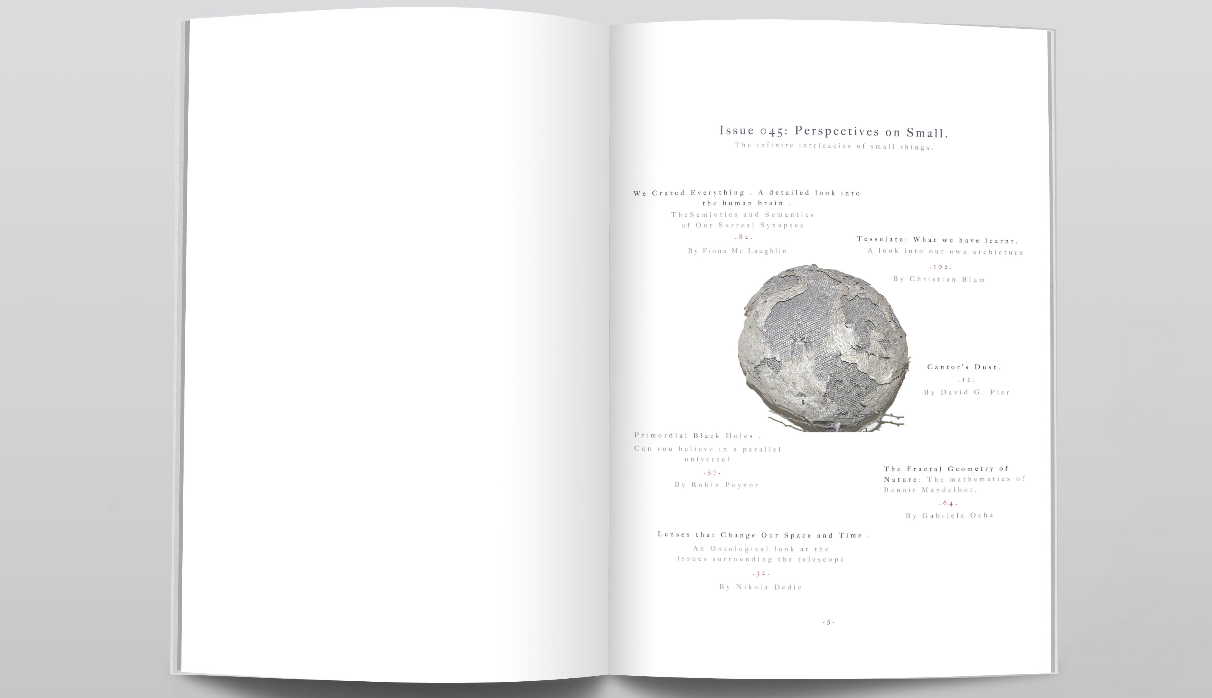
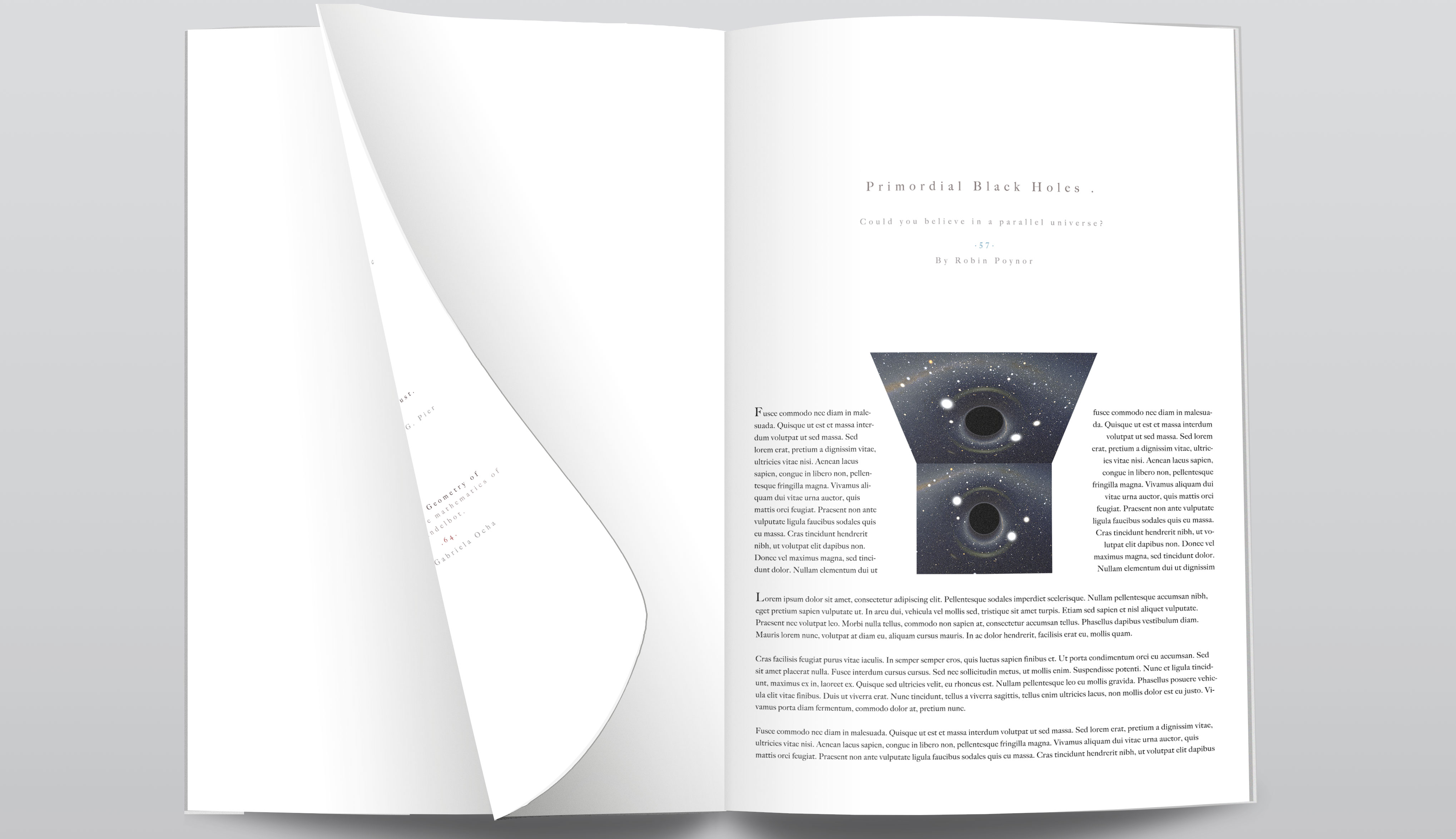
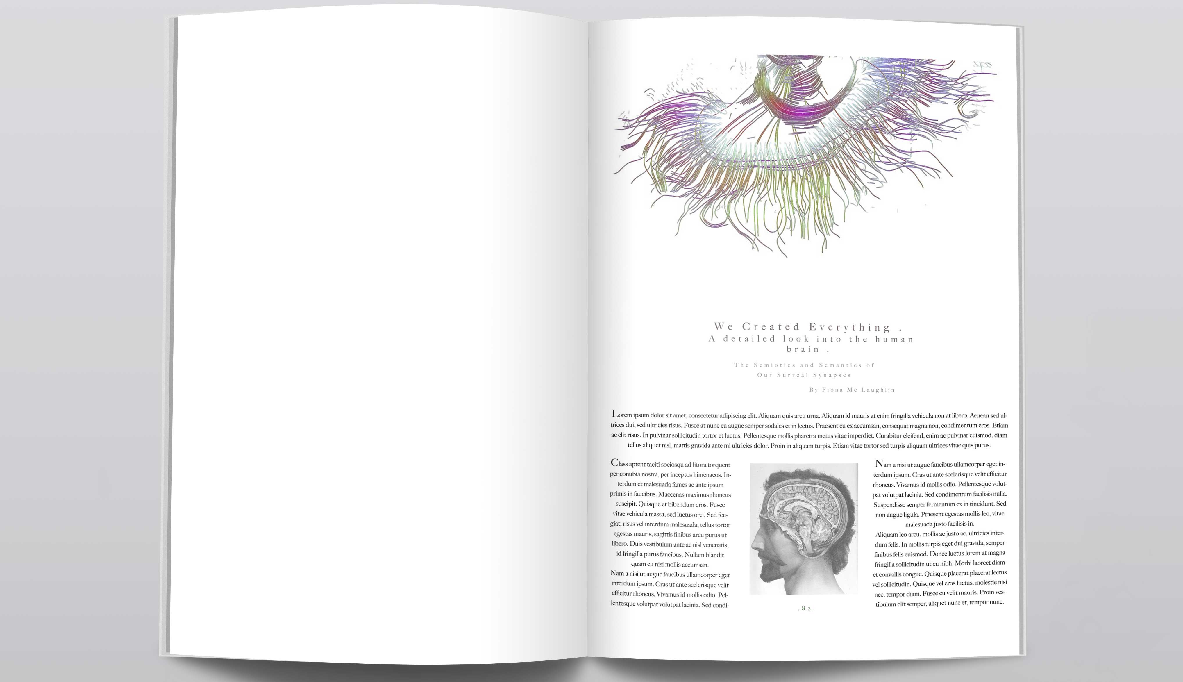
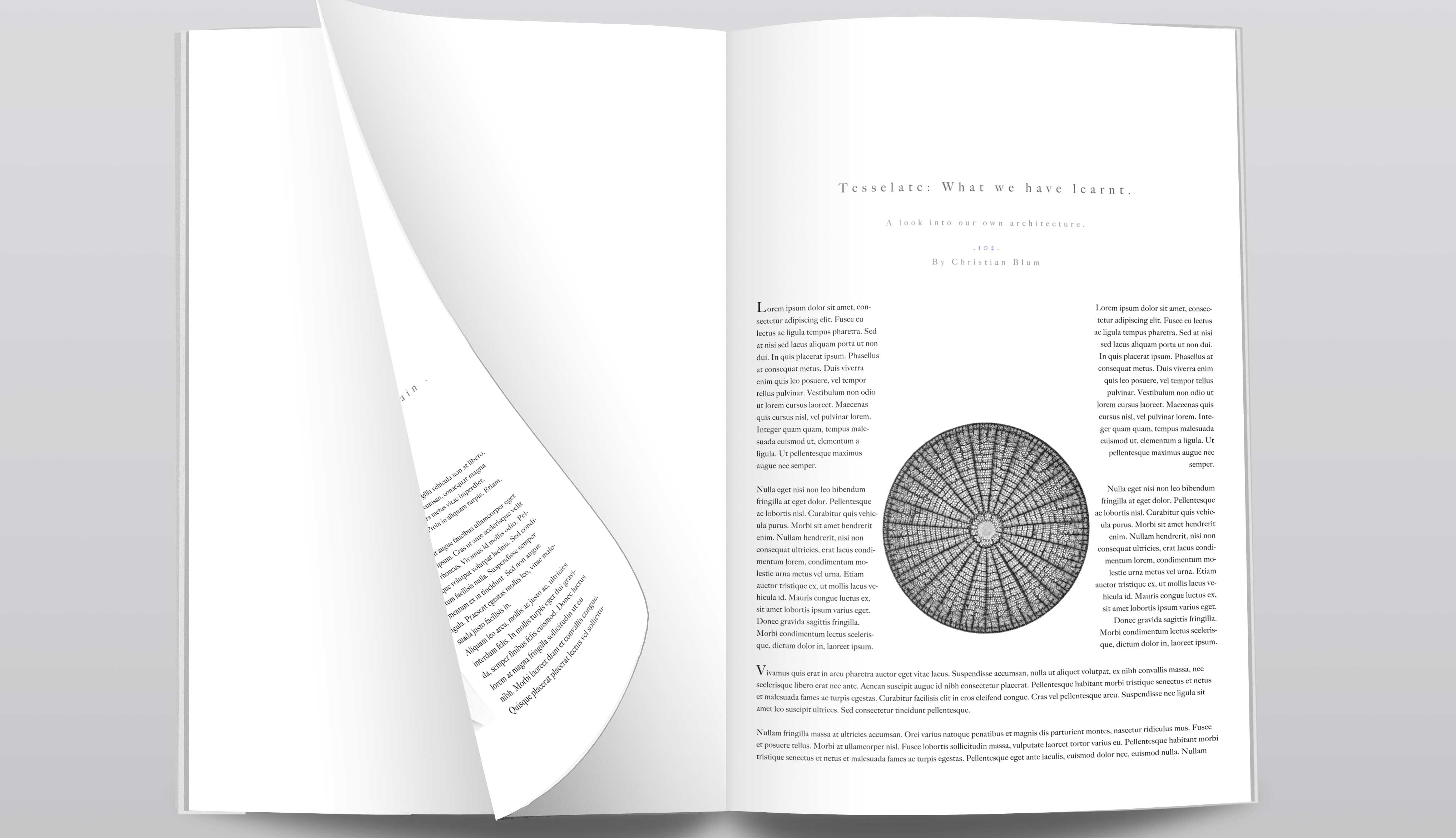
The Job Perspectives is a fictional quarterly magazine exploring the relationship between perception and experience, conceived for print and digital. Every issue is built around a single theme. This one, Perspectives on Small, moves from primordial black holes to the wiring of the human brain. The challenge was to translate abstract, thought-driven ideas into a tactile, cohesive design language. I developed the concept, visual identity, and editorial design, from the cover through the table of contents and feature spreads, along with the issue's article ideas, titles, and bylines.
The Process I began by defining the publication's tone: calm, analytical, and visually deliberate. I worked through grid systems and type hierarchies to create rhythm across pages. Scientific imagery, from archival engravings to modern brain scans, was treated as moments of visual pause, textures that support each article without overwhelming it. I set the headings in a widely spaced serif, so the spreads read like quiet specimen plates. Generous white space gives the long-form layouts room to breathe and lets every image hold the page.
The palette stays largely neutral, so the rare moments of colour land with more weight. Each element was weighed for how the reader experiences both the print and digital versions of the magazine.
Creative Direction The vision was a publication as considered as the ideas it presents, where type, image, and text work together like partners in conversation, creating a quiet space for reflection.
duties: creative direction, concept creation, editorial planning, graphic design